Historical data processing (value widget)
Last edited: August 6th 2025
With the release of version 5.3, it's now possible to process historical data within the Value widget on Next-Gen Dashboards. Previously, only the latest received value within the selected time period could be displayed.
This behavior can be configured via the Historical Data Processing option found in the widget editor of the Value widget:
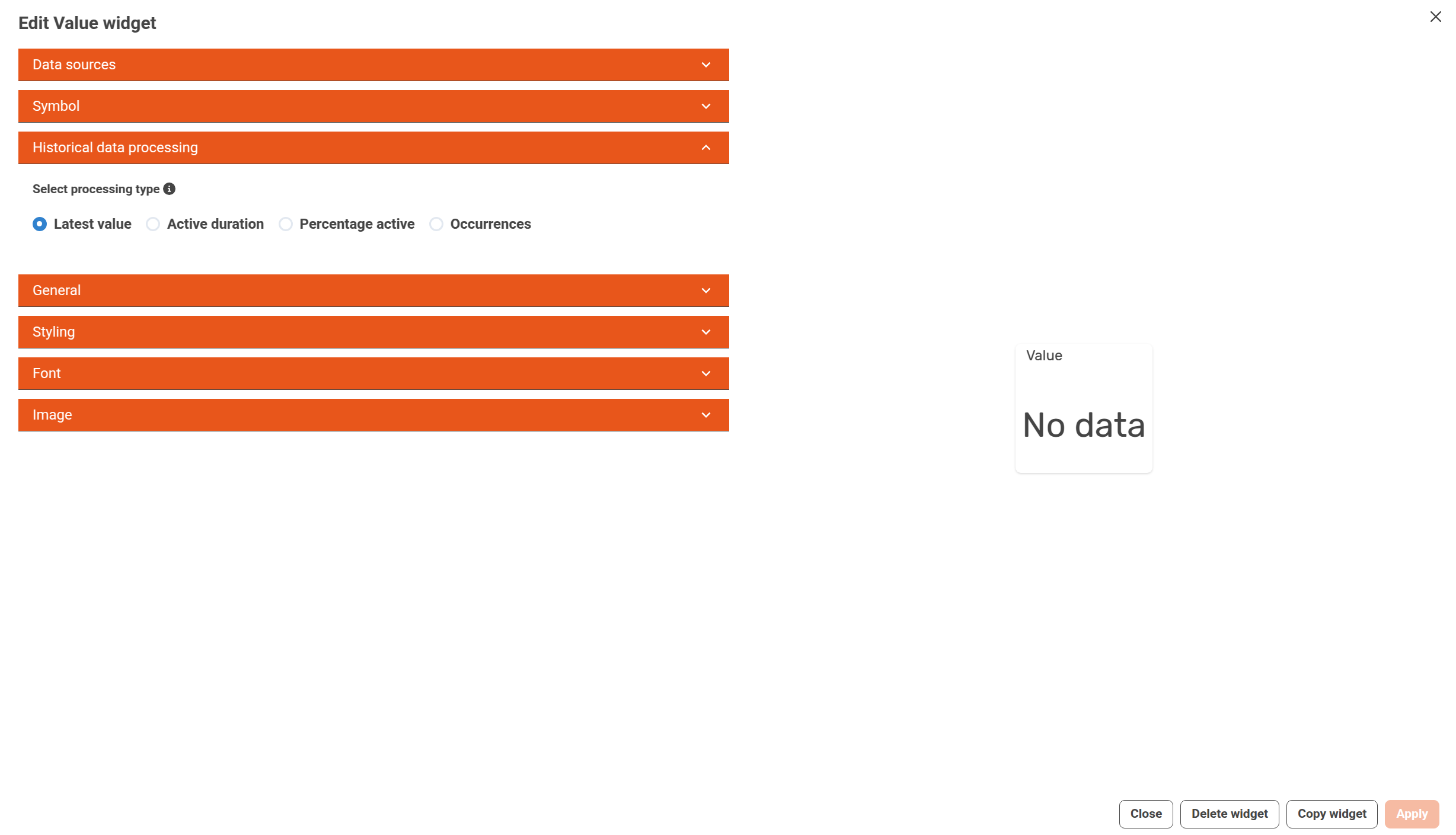
There are currently four processing modes available:
-
Latest value (default)
Displays the most recent value received within the selected time range. -
Active duration
Calculates the total amount of time (e.g. 2h 15m) the data source has been in an active or truthy state during the selected period. This is useful for tracking how long a machine or sensor has been active, above a threshold, or in a specific condition. -
Percentage active
Shows the percentage of the time the data source was in an active or truthy state within the selected period. For example, if a condition was true for 6 hours during a 24-hour window, this would show 25%. -
Occurrences
Counts the number of times the data source transitions from an inactive (false) state to an active (true) state during the selected period. This can be used to detect events such as alarms triggering, threshold crossings, or machine startups.
Note:
"Active duration" and "Percentage active" can be combined to display both values together, e.g. 2h 15m (25%).
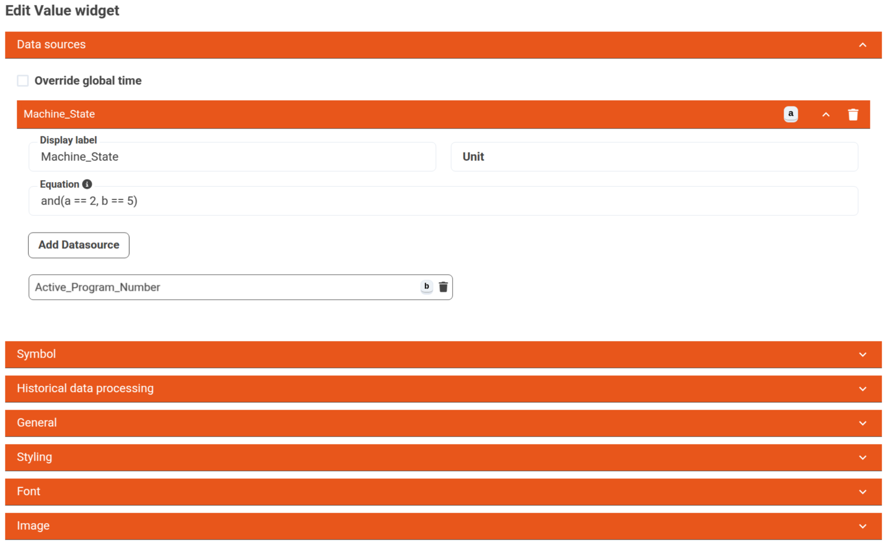
Logical Statements
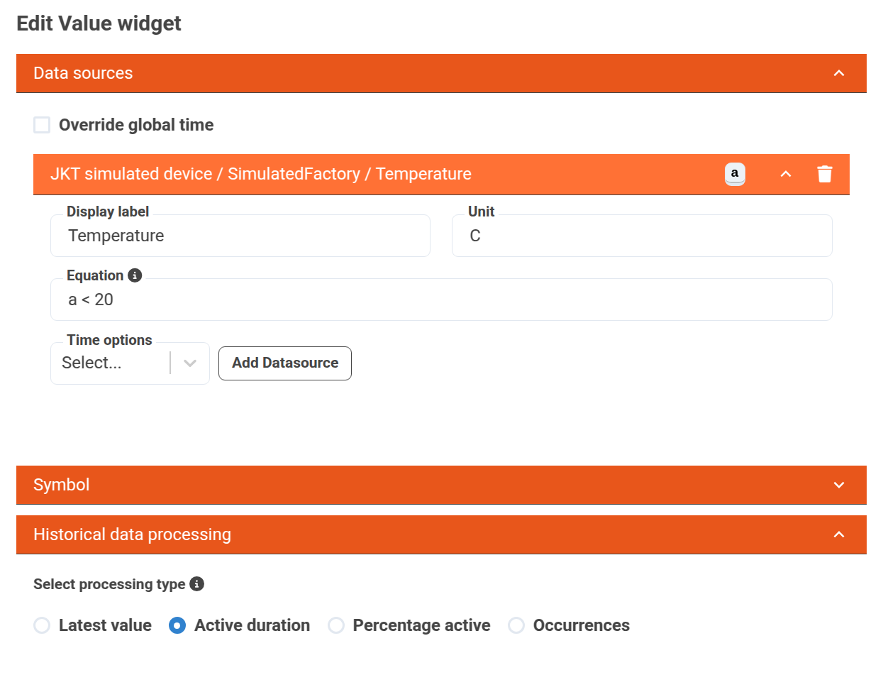
In order to define when a data source is considered active or truthy, a logical equation must be specified in the equationfield of a data source.
A value is treated as truthy based on how JavaScript evaluates truthy and falsy values.
The equation field allows you to define dynamic expressions using data sources and mathematical operations, based on the math.js library.
Each letter (e.g., a, b, c) represents a data source, and these can be combined using logical operators, math functions, and constants.
A simple example could be checking how often a temperature sensor reports a value below 20°C.
First, we define the logical statement in the equation field:
After applying the changes, the result might look like this:
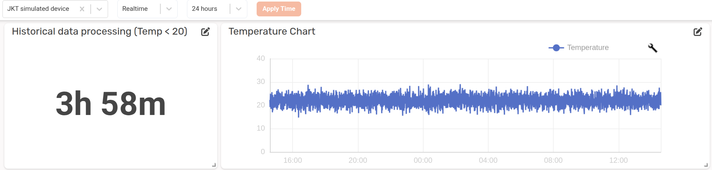
In this case, the temperature has been below 20°C for a total of 3 hours and 58 minutes within the last 24 hours, whereas the chart shows the temperature during the whole time period.
Combining Multiple Data Sources
While simple equations allow you to monitor basic conditions (like temperature thresholds), more advanced scenarios can be achieved by combining multiple data sources within an equation.
In this example, we want to understand how often the machine has been in a Working state while running a specific program—something that can’t be easily deduced by simply viewing the graphs alone:
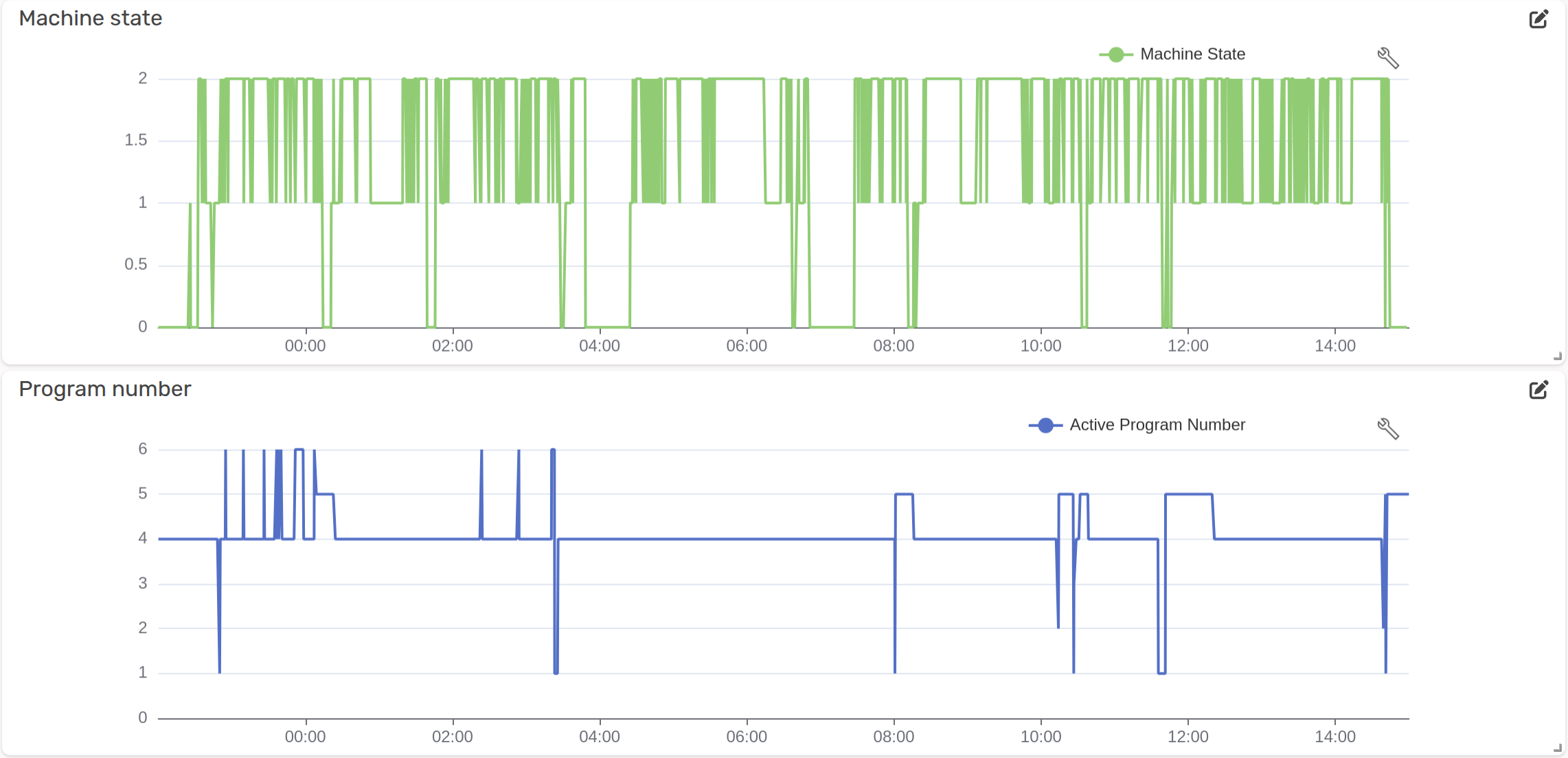
- The first graph shows the machine state, where values represent:
0= Stopped/Offline1= Idle2= Working
- The second graph shows the active program number, ranging from
1to6.
Our goal is to calculate how much time the machine has been Working AND using Program 5.
This can be done using the following logical equation:
The resulting output will look like this:
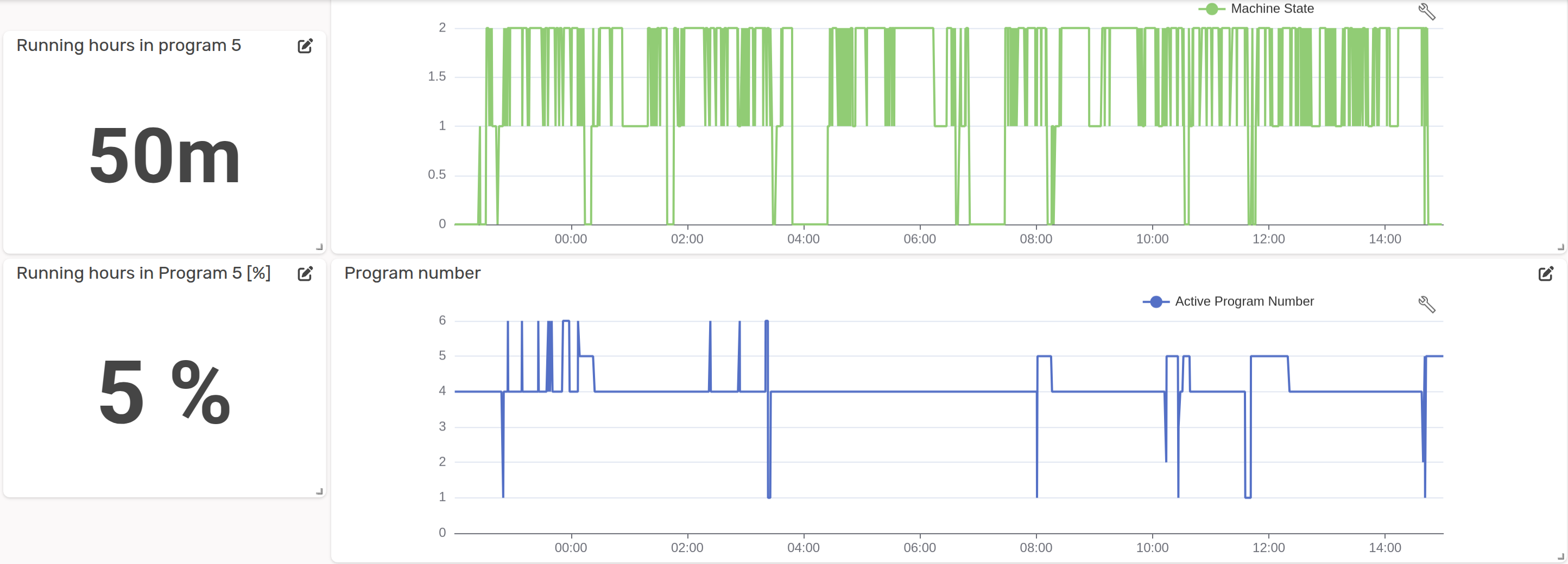
This means that the logical statement Working AND Program 5 has evaluated to true for a total duration of 50 minutes, which corresponds to 5% of the selected time period.