Inuatek DCC Widget Customization Guide
This guide shows how to customize Inuatek's default chart and gauge widgets using Apache ECharts, with real examples used in your platform. It includes:
- Base widget configurations
- Progressive modifications
- Hints to empower users to make their own visualizations
NOTE: A prerequisite for fully understanding the below is some knowledge about the structure of JS and JSON formats.
📊 Line Chart Widget
🟢 Base Widget (Time Series Line Chart)
{
  "xAxis": {
    "type": "time",
    "axisLabel": {
      "hideOverlap": true
    }
  },
  "yAxis": {
    "type": "value"
  },
  "legend": {
    "show": true,
    "type": "scroll",
    "right": "20%"
  },
  "grid": {
    "bottom": 27,
    "top": 30
  },
  "backgroundColor": "rgb(0 0 0 / 0%)",
  "tooltip": {
    "show": true,
    "trigger": "axis"
  },
  "dataZoom": [
    {
      "type": "inside",
      "disabled": true,
      "start": 0,
      "end": 100
    }
  ],
  "series": [
    {
      "data": "Datasource_unique_id",
      "type": "line",
      "name": "Name",
      "sampling": "lttb",
      "symbol": "none"
    }
  ]
}
🛠 Modified Version – With Area Fill, Stepped Line & VisualMap
{
    "backgroundColor": "rgb(0 0 0 / 0%)",
    "dataZoom": [
        {
            "disabled": true,
            "end": 100,
            "start": 0,
            "type": "inside"
        }
    ],
    "grid": {
        "bottom": 27,
        "top": 30
    },
    "legend": {
        "right": "20%",
        "show": true,
        "type": "scroll"
    },
    "series": [
        {
            "areaStyle": {},
            "data": "Datasource_unique_id",
            "lineStyle": {},
            "name": "Name",
            "sampling": "lttb",
            "step": "start",
            "symbol": "none",
            "type": "line"
        }
    ],
    "tooltip": {
        "show": true,
        "trigger": "axis"
    },
    "visualMap": {
        "outOfRange": {
            "color": "#999"
        },
        "pieces": [
            {
                "color": "#93CE07",
                "gt": 0,
                "lte": 1
            },
            {
                "color": "#FBDB0F",
                "gt": 1,
                "lte": 2
            },
            {
                "color": "#FC7D02",
                "gt": 2,
                "lte": 3
            },
            {
                "color": "#FD0100",
                "gt": 3,
                "lte": 4
            },
            {
                "color": "#AA069F",
                "gt": 4,
                "lte": 5
            },
            {
                "color": "#AC3B2A",
                "gt": 5
            }
        ],
        "right": 10,
        "top": 50
    },
    "xAxis": {
        "axisLabel": {
            "hideOverlap": true
        },
        "type": "time"
    },
    "yAxis": {
        "type": "value"
    }
}
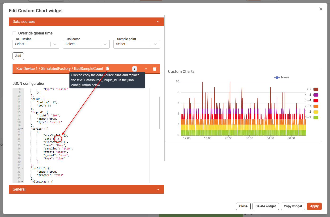
In the DCC Widget editor, the real variable data source BadSampleCount is selected and automatically assigned the alias "a".You must replace "Datasource_unique_id" in your JSON configuration with "a" to bind this data source.
Key Modifications:
| Feature | From Base | Modified |
|---|---|---|
| Filled area | No "areaStyle" | Add "areaStyle": {} |
| Stepped Line | No "step" | Add "step": "start" |
| Color zones | Not present | Add visualMap.pieces |
| Line styling | Basic | Add lineStyle object for future extension |
🕹️ Gauge Widget
🟢 Base Widget (Circular Gauge)
{
  "backgroundColor": "rgb(0 0 0 / 0%)",
  "tooltip": {
    "formatter": "{a} : {c} ",
    "alwaysShowContent": false,
    "hideDelay": 100,
    "confine": true
  },
  "grid": {
    "top": 0,
    "left": 0,
    "right": 0,
    "bottom": 0,
    "show": false,
    "containeLabel": true
  },
  "series": [
    {
      "name": "name",
      "center": {
        "0": "50%",
        "1": "55%"
      },
      "progress": {
        "show": false
      },
      "type": "gauge",
      "detail": {
        "formatter": "{value} °C",
        "show": true,
        "valueAnimation": true,
        "offsetCenter": [0, "60%"],
        "fontSize": 10,
        "fontWeight": "bold"
      },
      "min": 0,
      "max": 100,
      "radius": "100%",
      "splitNumber": 10,
      "itemStyle": {},
      "axisLine": {
        "lineStyle": {
          "color": [
            [0.3, "#67e0e3"],
            [0.8, "#37a2da"],
            [1, "#fd666d"]
          ],
          "width": 10
        }
      },
      "axisLabel": {
        "fontSize": 12,
        "distance": 15
      },
      "axisTick": {
        "length": 6,
        "splitNumber": 5,
        "distance": 10,
        "show": true,
        "lineStyle": {
          "width": 1,
          "type": "solid"
        }
      },
      "splitLine": {
        "length": 10,
        "distance": 10,
        "show": true,
        "lineStyle": {
          "width": 3,
          "type": "solid"
        }
      },
      "pointer": {
        "show": true,
        "length": "60%",
        "width": 6,
        "itemStyle": {
          "color": "auto"
        }
      },
      "data": "Datasource_unique_id"
    }
  ]
}
🛠 Modified Version – Tank-Style Bar Chart
{
    "grid": {
        "bottom": "15%",
        "height": "70%",
        "left": "35%",
        "right": "35%",
        "top": "15%"
    },
    "series": [
        {
            "animation": false,
            "barCategoryGap": 0,
            "barGap": "-100%",
            "barWidth": 180,
            "data": "Datasource_unique_id_static",
            "itemStyle": {
                "borderColor": "#333",
                "borderRadius": [
                    30,
                    30,
                    30,
                    30
                ],
                "borderWidth": 4,
                "color": "transparent"
            },
            "label": {
                "show": false
            },
            "name": "Tank Container",
            "tooltip": {
                "show": false
            },
            "type": "bar",
            "z": 3
        },
        {
            "backgroundStyle": {
                "opacity": 0
            },
            "barWidth": 180,
            "data": "Datasource_unique_id",
            "itemStyle": {
                "borderRadius": [
                    30,
                    30,
                    30,
                    30
                ],
                "color": "#007bff"
            },
            "label": {
                "color": "#000",
                "fontSize": 24,
                "formatter": "{c}",
                "position": "top",
                "show": true
            },
            "name": "Tankniveau",
            "type": "bar"
        }
    ],
    "tooltip": {
        "formatter": "{b}: {c}%"
    },
    "xAxis": {
        "data": [
            "tank"
        ],
        "show": false,
        "type": "category"
    },
    "yAxis": {
        "axisLabel": {
            "show": false
        },
        "axisLine": {
            "show": false
        },
        "axisTick": {
            "show": false
        },
        "inverse": false,
        "max": 100,
        "min": 0,
        "splitLine": {
            "show": false
        },
        "type": "value"
    }
}
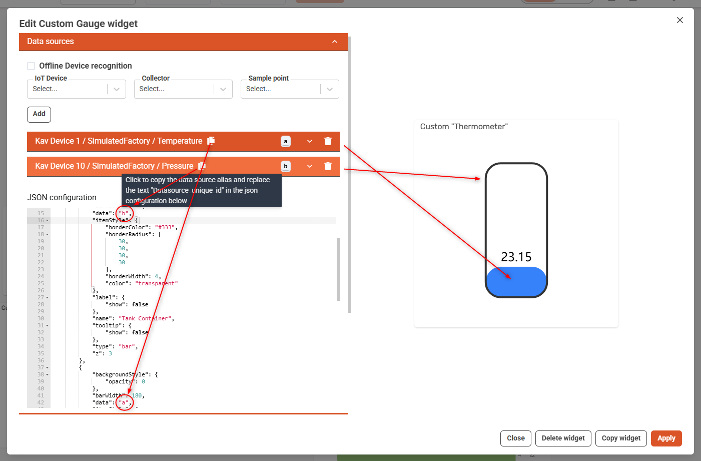
In the DCC Widget editor, the real variable data source Temperature is selected, and in this case translates to a which replaces Datasource_unique_id while we use Pressure as dummy data for defining the frame, which in this case translates as b, which replaces Datasource_unique_id_static, (i.e. it does not matter what value Pressure has).
📌 Tip: Hover over the clipboard icon next to each data source to auto-copy its alias.
Key Modifications:
| Feature | From Gauge Widget | Modified |
|---|---|---|
| Visualization type | gauge | Two stacked bar series |
| Visual structure | Circular needle | Tank-like rectangle with fill |
| Dummy container | Not present | Datasource_unique_id_static used as frame |
| Label format | "formatter": "{value} °C" | "formatter": "{c}" and position on top |
🧪 Option: Testing in ECharts Editor
- Wrap JSON as Javascript and paste the JavaScript
option = { ... }snippet into ECharts Editor. - Replace
"Datasource_unique_id"with dummy data, e.g.data: [[timestamp, value]]ordata: [value]. - Visualize and iterate interactively.
🟡 Step 1: Wrap JSON in JavaScript
The ECharts editor expects JavaScript format, so wrap your JSON like this:
option = {
  // your JSON here
};
So, for example, you take this JSON:
{
  "xAxis": {
    "type": "time"
  },
  "series": [
    {
      "data": "Datasource_unique_id",
      "type": "line"
    }
  ]
}
And convert it to this Javascript:
option = {
  xAxis: {
    type: 'time'
  },
  series: [
    {
      data: [], // We'll add dummy data here
      type: 'line'
    }
  ]
};
💡 Tip: When converting JSON to JavaScript:
- Remove quotes from property names (e.g.,
type: 'line'instead of"type": "line") - Use single quotes around string values
- Wrap the JSON in
option = { ... }
✅ Replace "Datasource_unique_id" with actual test data (see below)
💡 HINT
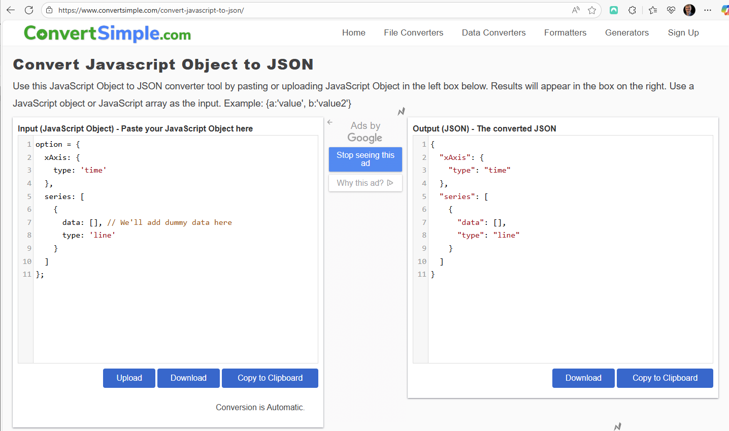
You can also do the reverse, i.e. starting from Echart JS, and convert to JSON. You can use ChatGPT or similar, or an online tool like this:
🟡 Step 2: Add Dummy Data
Define dummy data to simulate your widget's behavior without needing live data input. This is useful when testing in the ECharts Editor:
Time Series Chart Example:
data: [
  ['2025-01-01T00:00:00Z', 0.5],
  ['2025-01-01T01:00:00Z', 1.5],
  ['2025-01-01T02:00:00Z', 2.2],
  ['2025-01-01T03:00:00Z', 3.4],
  ['2025-01-01T04:00:00Z', 5.5],
  ['2025-01-01T05:00:00Z', 4.8]
]
For Tank-style Bar Chart
- Static frame (outer tank):
data: [100] // always full
- Fill level:
data: [72] // current level
🟡 Step 3: Paste into Editor
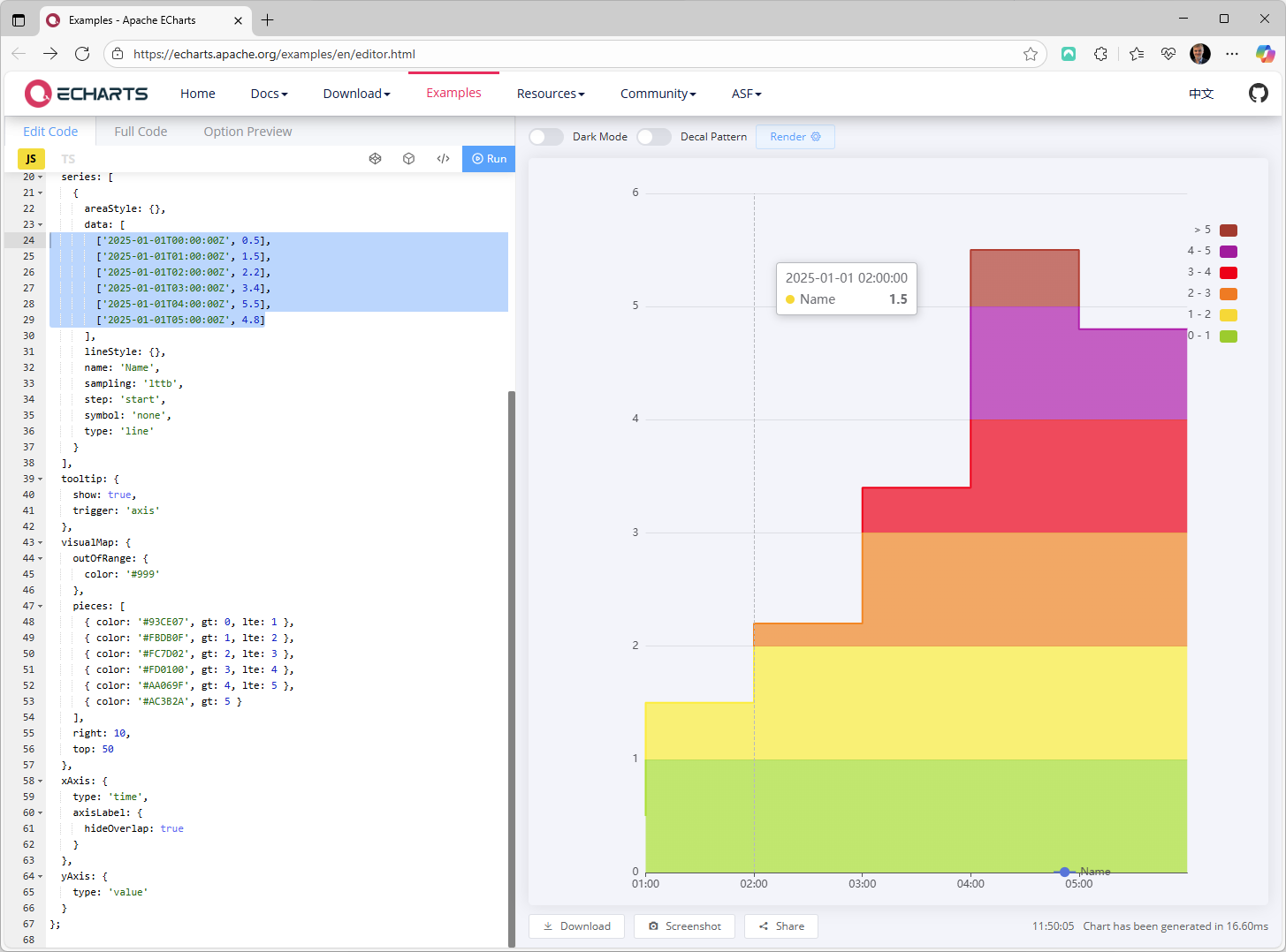
Full working JS example for a time series line chart:
option = {
  backgroundColor: 'rgb(0 0 0 / 0%)',
  dataZoom: [
    {
      disabled: true,
      end: 100,
      start: 0,
      type: 'inside'
    }
  ],
  grid: {
    bottom: 27,
    top: 30
  },
  legend: {
    right: '20%',
    show: true,
    type: 'scroll'
  },
  series: [
    {
      areaStyle: {},
      data: [
        ['2025-01-01T00:00:00Z', 0.5],
        ['2025-01-01T01:00:00Z', 1.5],
        ['2025-01-01T02:00:00Z', 2.2],
        ['2025-01-01T03:00:00Z', 3.4],
        ['2025-01-01T04:00:00Z', 5.5],
        ['2025-01-01T05:00:00Z', 4.8]
      ],
      lineStyle: {},
      name: 'Name',
      sampling: 'lttb',
      step: 'start',
      symbol: 'none',
      type: 'line'
    }
  ],
  tooltip: {
    show: true,
    trigger: 'axis'
  },
  visualMap: {
    outOfRange: {
      color: '#999'
    },
    pieces: [
      { color: '#93CE07', gt: 0, lte: 1 },
      { color: '#FBDB0F', gt: 1, lte: 2 },
      { color: '#FC7D02', gt: 2, lte: 3 },
      { color: '#FD0100', gt: 3, lte: 4 },
      { color: '#AA069F', gt: 4, lte: 5 },
      { color: '#AC3B2A', gt: 5 }
    ],
    right: 10,
    top: 50
  },
  xAxis: {
    type: 'time',
    axisLabel: {
      hideOverlap: true
    }
  },
  yAxis: {
    type: 'value'
  }
};
Which gives this result in eCharts Editor
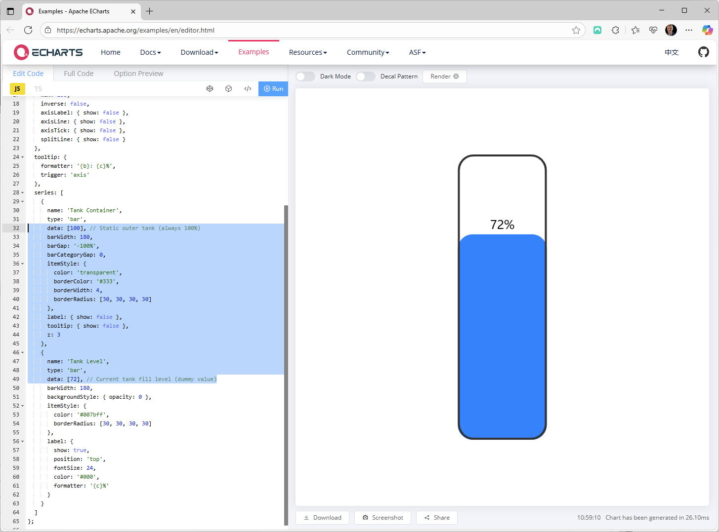
Full working JS example for Tank-style Bar Chart:
option = {
  grid: {
    bottom: '15%',
    height: '70%',
    left: '35%',
    right: '35%',
    top: '15%'
  },
  xAxis: {
    type: 'category',
    data: ['tank'],
    show: false
  },
  yAxis: {
    type: 'value',
    min: 0,
    max: 100,
    inverse: false,
    axisLabel: { show: false },
    axisLine: { show: false },
    axisTick: { show: false },
    splitLine: { show: false }
  },
  tooltip: {
    formatter: '{b}: {c}%',
    trigger: 'axis'
  },
  series: [
    {
      name: 'Tank Container',
      type: 'bar',
      data: [100], // Static outer tank (always 100%)
      barWidth: 180,
      barGap: '-100%',
      barCategoryGap: 0,
      itemStyle: {
        color: 'transparent',
        borderColor: '#333',
        borderWidth: 4,
        borderRadius: [30, 30, 30, 30]
      },
      label: { show: false },
      tooltip: { show: false },
      z: 3
    },
    {
      name: 'Tank Level',
      type: 'bar',
      data: [72], // Current tank fill level (dummy value)
      barWidth: 180,
      backgroundStyle: { opacity: 0 },
      itemStyle: {
        color: '#007bff',
        borderRadius: [30, 30, 30, 30]
      },
      label: {
        show: true,
        position: 'top',
        fontSize: 24,
        color: '#000',
        formatter: '{c}%'
      }
    }
  ]
};
Which gives this result in eCharts Editor
✅ Summary
| Task | How |
|---|---|
| Convert JSON to JS | Wrap with option = { ... }, remove quotes around keys |
| Use dummy data | Replace "Datasource_unique_id" with sample values |
| Test output visually | Paste into the ECharts Online Editor |